 |
|||||||
|
|
|||||||
|
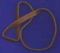
The symbolism here is that of the complexities of life itself, with its many twists and turns, but always ending up at the point where you started, and the larger loop on the right represents the massive gullibility on the part of those commissioning the ‘work’. The use of continuous curves is, of course, to indicate that there can be no parallels save, obviously, reference to the Emperor's
|
|||
|
[Home] [Office Life] [Manager] [Right To Reply] [Dictation] [Office Quotes] [Our New Logo] [English] [Resource] [That Place] [Quotes] [Oddities] [Contact] |
 This will be our new branding logo. To the uninitiated, it may look like a coiled rubber band. However, it is the culmination of several seconds work by a specially commissioned design committee whose expertise enables them, almost uncannily, to see a mug coming from several miles away.